חיפושים אחרונים
אפשרויות חיפוש
#rtistry
5 הודעות5 משתתפיםות0 הודעות היום


 New blog post about data art!
Have you ever wondered:
 What is data-driven art?
 Why do people make data art?
 How do I get started making my own?
Then this blog post is for you!  It includes an example using #TidyTuesday data - with code in both #Python and #RStats!
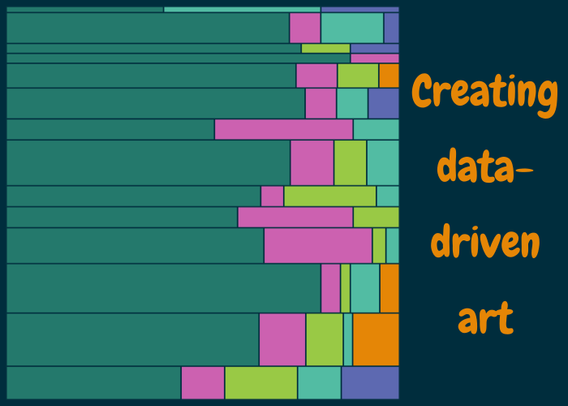
Nicola RennieCreating data-driven art | Nicola RennieIf you've ever wondered what data-driven art is, or why people make it, then reading this blog post should help to answer those questions. It also includes an example of data-driven art, which can be created in Python or R, and talks through the process of getting started with your own art.


I've started collecting together some of my examples of data-driven art (with accompanying code) into a gallery
Link: https://nrennie.rbind.io/data-art/
(Blog post coming soon about what I think data art is and why it's useful, alongside a tutorial-style example!)


Just doing some iteration practice with the purrr package. Made in #ggplot2 with #rstats #rtistry #genartclub

A little bit of #DataArt on a Monday afternoon! Can you guess the data?

More generative art experiments (trying to create a sketch/calligraphy effect)

I recently had fun making a new cover image for Mastodon by making treemaps of colours used in Bob Ross paintings (columns are seasons and rows are episodes)!
 Painting data from #TidyTuesday
 Image processing with {imager} Colours extracted using {eyedroppeR}
 Pixel analysis in #RStats Plotting with {treemapify}


During #Genuary2025, I created three different variations of a photograph - all done using just image manipulation in #RStats!
Pixelate and recolour an image Detect colours and print them to a spreadsheet
 Reorder each row of pixels based on colour intensity Original image
(Bonus points if you know where the original photo was taken!)


Genuary 2025 Day 27: Make something interesting with no randomness or noise or trig.


Genuary 2025 Day 25: One line that may or may not intersect itself.
(Very much inspired by the pattern you make when trying to check if a pen works!)

Taking being an #RStats nerd to the next level... (AKA when generative art makes it out of the laptop and into the kitchen!  )
)


